Frida Björk Culjak
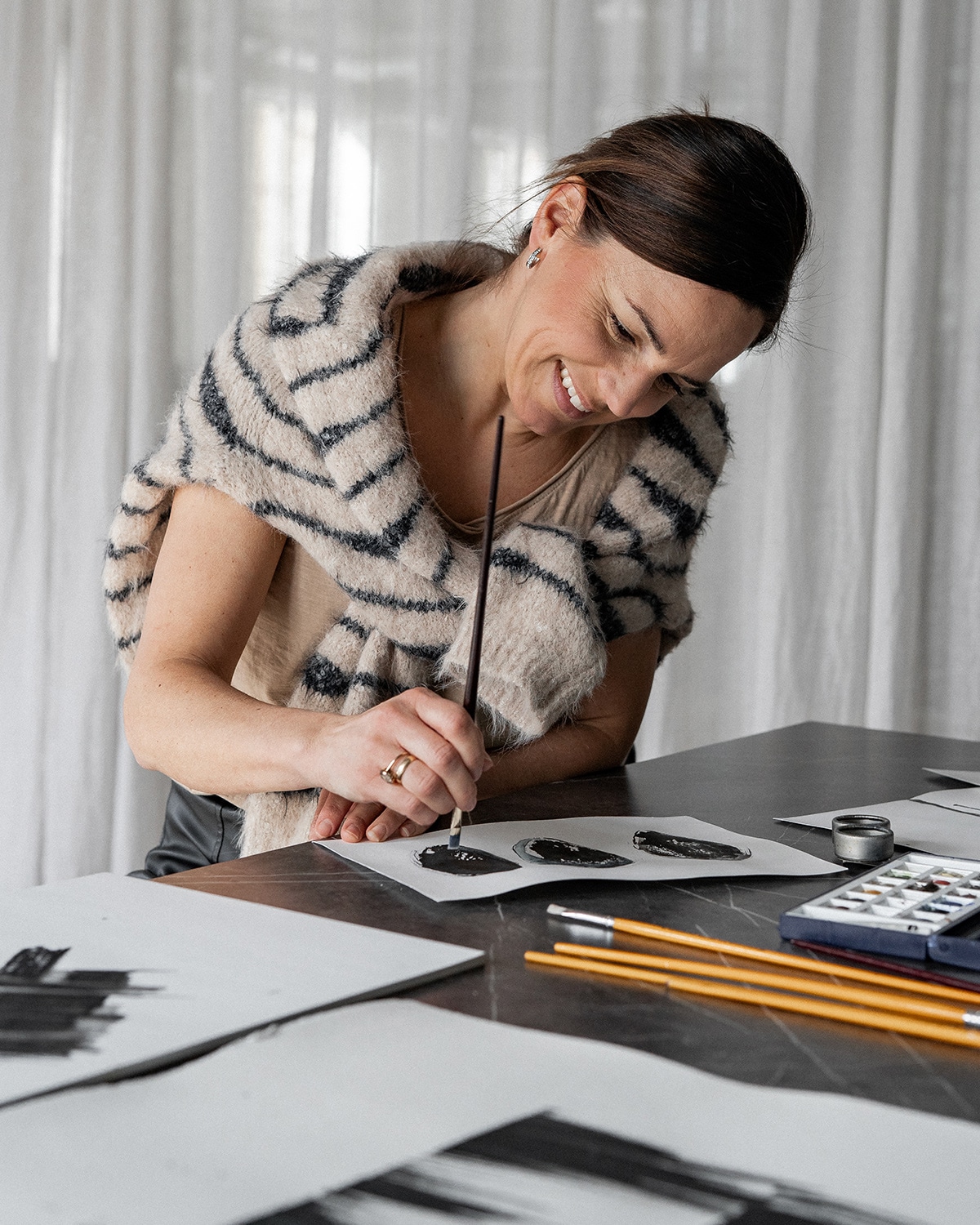
Like a legacy from her grandmother – who loved to paint, embroider and sculpt – Frida has always loved to work creatively. After spending an internship period at an advertising agency, it was clear: it is in the world of advertising, among color and form, that she belongs.
Frida's graphic design language is lively, preferably with details that are not "too perfect". Her art should not be too obvious, but should preferably invite the viewer to analyse. The colors are natural and warm, and act in the stillness to let the subject take its place. Frida finds her main inspiration in bookstores, where color and shape among book covers give a lot of new thoughts and ideas.
Among Frida's posters, her skill in drawing is clearly visible; rough pencil strokes that captures interesting shapes. Forms that for Frida are born and begin in the most unexpected situations, such as just before she falls asleep at night - so she always keep the idea pad on her night stand.

